Research: Jem Southam

Jem Southam is a British landscape photographer whose works largely focuses around the theme of change at a certain location, sometimes over many years. His work seems to me to possess a quiet calmness with colours reminiscent of Northern European painters such as Casper Friedrich.

Hi work contains a high level of detail that allows the viewer to contemplate what may have happened; a rockfall, a strange indentation; there is a sense of the sublime but his work also invites contemplation of the changes that have occurred between depictions of the same location.

Southam is of particular interest to me because of his investigations into humankind’s relationship with the landscape, both in terms of our impact through habitation and the actions we take in the environment, but also there is a strong sense of the psychological impact the landscape has on us as people, yet he does not feature people in his work.

His work is also particularly relevant to me because he is also based in the South West, and his work is a prime example of how it is not necessary to travel far to achieve interesting, accomplished photography work.

Jem Southam

Senneville-sur-Fecamp (2006)

Jem Southam

Penwith Moors, Bosporthennis Common (1998)

Assignment 6: Transitions

This assignment requires a series of images that responds to the idea of ‘transitions’ within the landscape and that records the changes that a part of the landscape undergoes over an extended period of time.

Living in Devon, a holiday destination, I am very conscious of the region where I live being considered an area of beauty, and of visitors thinking of the South West in terms of picture postcard, typically picturesque images. Landscape photographers are increasingly aware of the other ‘side’ of holiday destinations; for example, human poverty existing in close proximity to a much-visited attraction. However, the reality is often not as clear cut. Visitors do not often think about the existence of the attractions themselves outside of the holiday season, many of which will struggle financially if the season is beset by inclement weather or a rise in popularity of a different destination.

At the time of starting this project, I had no idea that the COVID-19 pandemic would decimate many businesses during 2020, and whilst there was a boom in UK travel as people were unable to travel abroad, UK tourist attractions did not necessarily reap the financial benefits due to government restrictions on which could remain open at certain times. Thus, when I first started photographing Tinside Lido in Plymouth during the 2019 summer season, I was expecting to see a lull in activity through the winter, with a summer boom and a subsequent return to inactivity. The reality turned out to be somewhat different, with the lido seeming to me to become a metaphor for the fortunes of the city during this uncertain time. As I write, cleaning of the pool will soon commence again as a sign of hope that 2021 will see more of a return to normality, but in these uncertain times it is unclear what this season will bring and whether the efforts will be futile.

Assignment 5: Self-Directed Project

This project is a culmination and convergence of themes that have been running though my work for some time now:

Through previous modules I have been interested in the repetitive nature of human behaviour; in particular the activities that we engage in year after year, generation after generation and document in family photograph albums. For this project, it was the family caravan holiday.

My second point of interest was pushing the boundaries of photography beyond capturing light in a camera: earlier in this course I investigated cyanotypes and lumen prints and for this assignment I looked at the ‘images’ sunlight creates on grass. In this case ‘images’ are overlaid again and again, making a photomontage recording each stay, until the end of the season when the grass is allowed to restore and regrow until the cycle begins again. Thus the project looks at the passing of time, regeneration and repetition in nature and human behaviour.

Evaluation

I am happy with the way this project has turned out, and I think that looking at sun marks on the earth is something I will continue to do for some time. I achieved what I set out to do which was to create an interesting set of images which tells us something of what has been happening whilst leaving a narrative element to the viewer to imagine. My original project brief is shown below and I think I have largely stuck to what I was intending to convey.

I will also remain interested in caravan parks; so many formative memories are created there and they are a specific environment created for a specific purpose which is has a landscape angle to be explored. I would also like to use grass further in my work, perhaps deliberately creating shapes in and perhaps also growing some in the gallery space.

Artist’s Statement

My work focuses of the dynamic tensions between landscape and people, even though people are rarely depicted. Whilst contemplating the landscape I am constantly thinking of the impact landscape has on humans both in a physical and emotional sense. Conversely, I am also interested in the impact humans have on the landscape, not just in the obvious sense of environmental damage, but also in more subtle ways, in the signs of human behaviour left behind on a small scale, temporary basis.

My piece on caravan parks focuses on the evidence left behind by holidaying families in the form of temporary photographic imprints on the grass; repetitive shapes made time and time again throughout the holiday season, leaving short term evidence of those who came before; regenerating year after year as the cycle begins again.

Project Brief

Around two years ago I became interested in how the marks on grass when it has been deprived of light are a kind of naturally occurring photography which, when an item is placed on it for a period of time and subsequently removed, create a silhouetted ‘image’ of that which has been placed there.

I began collecting images of this type of ‘photography’ when I came across it whilst out walking with my camera, whilst wondering what had previously been there to leave the image. Some large areas were indicative of a temporary structure of some sort, hinting at a gathering for an unknown occasion, whereas others were very small.

Inspired by artists challenging what constitutes photography such as Tom Lovelace, following on from my earlier work for this module using the sun to create cyanotypes and lumen prints, and also referencing my research on Land Art, I wanted to explore further these images that are made on the earth itself, which break through the limitations of photographic paper size boundaries.

I also bring to my work a personal interest in the family photo album, and particularly in the images we retake year after year in different forms, for example the holiday snap or the birthday party, and the idea that versions of these images are taken year after year, generation through generation. We are so familiar with these images that when we view someone else’s version, we can immediately imagine the scene beyond the boundaries of the shown image and subconsciously apply our own preconceptions and experience of the our imaginings. Thus it is so with the British caravan park; many people already have their own thoughts on what it is to holiday in this environment.

My project proposal is to combine the interests laid out above and explore how the images created by objects blocking natural light on grass create a new type of holiday photograph, that which hints at what has occurred at the particular site but leaves the viewer to imagine the scenes contained within that confined area of ground.

Exercise 5.7: Prepare your Artist’s Statement

My work focuses of the dynamic tensions between landscape and people, even though people are rarely depicted. Whilst contemplating the landscape I am constantly thinking of the impact landscape has on humans both in a physical and emotional sense. Conversely, I am also interested in the impact humans have on the landscape, not just in the obvious sense of environmental damage, but also in more subtle ways, in the signs of human behaviour left behind on a small scale, temporary basis.

My piece on caravan parks focuses on the evidence left behind by holidaying families in the form of temporary photographic imprints on the grass; repetitive shapes made time and time again throughout the holiday season, leaving short term evidence of those who came before; regenerating year after year as the cycle begins again.

Exercise 5.6: Context and Meaning

In his essay Context as a Determinant of Photographic Meaning John A Walker explains how changing where an image is displayed changes its context; in most cases this results in a change in emphasis of content. However, a total change in meaning can also result. It is also possible to change meaning by juxtaposition to text to something which was not signified by the image alone.

Paintings and sculptures were originally created in situ, for example as a mural. the portability of the canvas enabled mobility which lost connection between the work and specific places, culminating in the availability of photography on a global scale.

When photographs of a place are viewed out of context, it is common to research its original meaning, thus rendering it eternally fixed. Walker suggests that we should also be investigating its context through the different socio-historic junctures it has passed since its ‘birth’ thereby also considering its ‘life’. Walker cites Jo Spence’s series Beyond the Family Album, Private Images, Pubic Conventions, as a prime example of this; originally personal images, their meaning was emphasised differently when shown in a feminist magazine, a library and a gallery. If the context in which an image is displayed can be altered by the space in which it is shown it stands to reason that the influence can also extend the other way.

The mental preconceptions of the viewer must also be taken into account, whilst assuming that many people’s responses will be similar.

I found the concept of the context of images changing depending on where they are shown interesting and this is something I had not really considered before. Once of our local department stores has shown art exhibitions for a while and I have found it interesting and refreshing to view art in a different context. Whilst I envisage my submission for Assignment 5 to be shown in a traditional white space, the local lido images I have been producing for Assignment 6 would definitely benefit from being displayed in the space they were taken and I would like to approach the local council regarding this if I have the confidence to do so.

Exercise 5.5: Create a Slideshow

Whilst I created a slideshow for Assignment 3 using Windows Movie Maker, there is now an error uploading from this software. I tried various other methods, but all seem to either produce poor quality slideshows or cost money. In the end I have have had to use Google Slides for this exercise which isn’t ideal but at least conveys accurately how I wanted the slideshow to look. I have opted for a plain format with simple transitions and no music.

Exercise 5.4: Online Exhibitions

Sharon Boothroyd’s WeAreOCA article Online Exhibitions invites us to consider the slideshow format of presenting images, using Andy Adams’ Looking at the Land as an example.

At first I was daunted at the prospect of watching an eighteen minute slideshow; I thought my mind would wander part way through. I was also surprised that there was no music; my preconception was that this would be required to create ambience and to bring the exhibition, which is by different photographers, into a unified whole. On both counts I was wrong; the exhibition was utterly engaging and the absence of music enhanced the subdued feel of the images, which were often very simple in composition and at times reminded me of Mat Hennek’s Silent Cities series.

Overall, I really enjoyed the piece and saw a number of intriguing images that I would like to return to. I suppose the main downside of the format is the inability to linger longer over certain images, though that is easily overcome by further investigation by the viewer.

Exercise 5.3: Print on Demand Mock up

For this exercise I have prepared a mock up submission for Assignment five using book software from Blurb. I have used Blurb before so found the software relatively easy to use. I have a personal preconception that a photographic book needs text to accompany the images (even though i have purchased ones that do not) and for that reason I probably would not consider a book as my choice of presentation for this particular assignment since I want to present the images without text. However, it is a medium I would consider for future projects should I deem it appropriate.

Exercise 5.2: Print Quotes

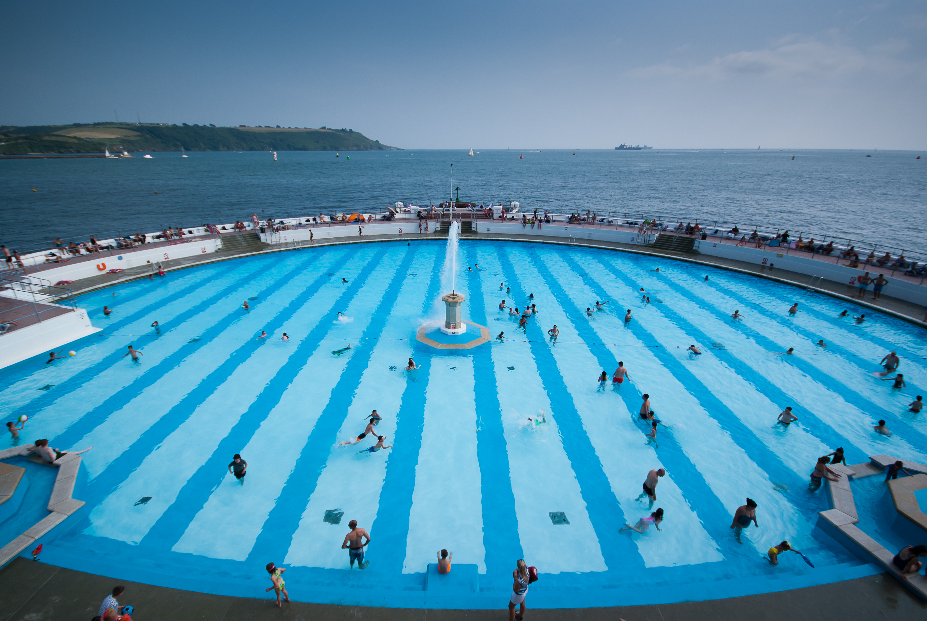
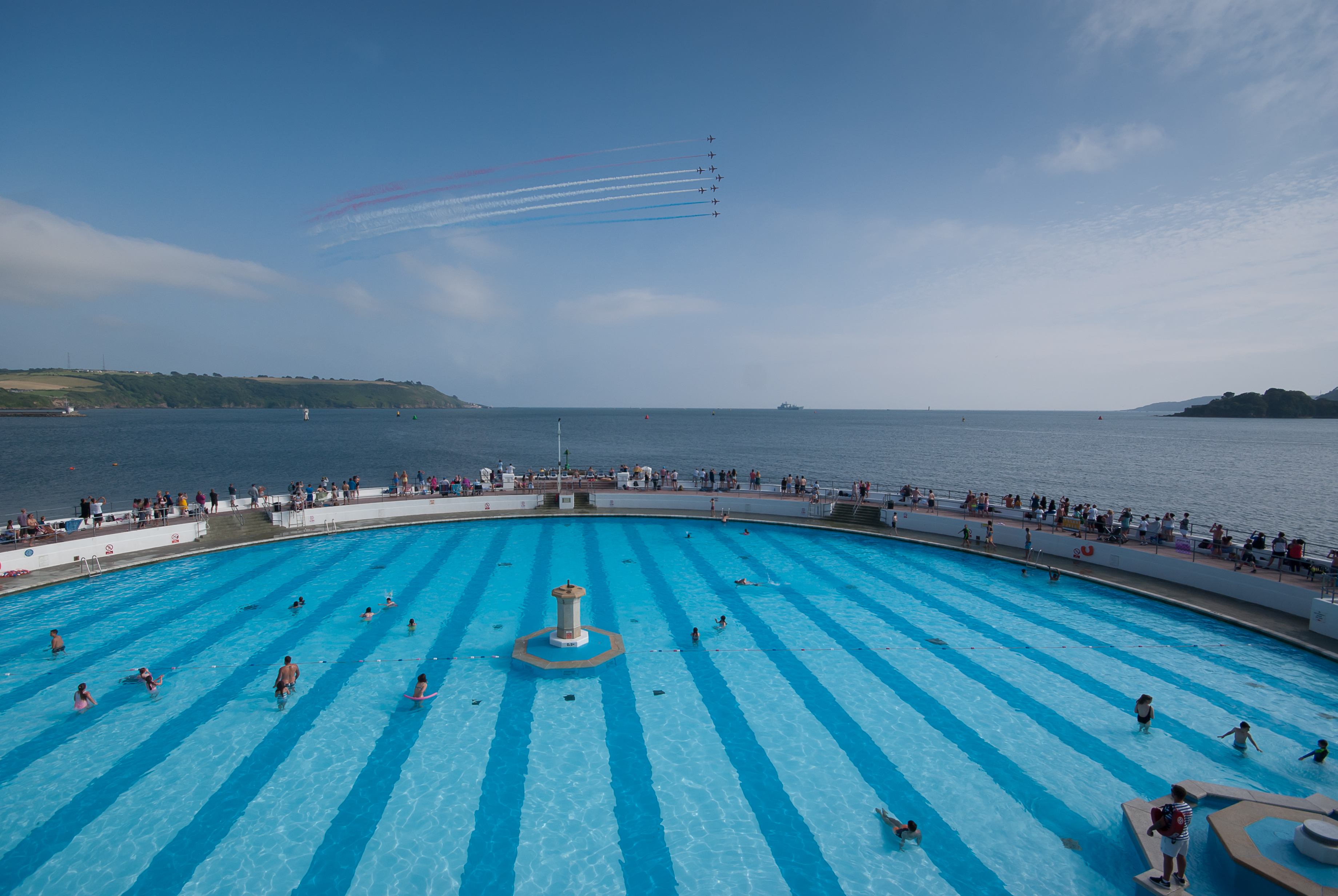
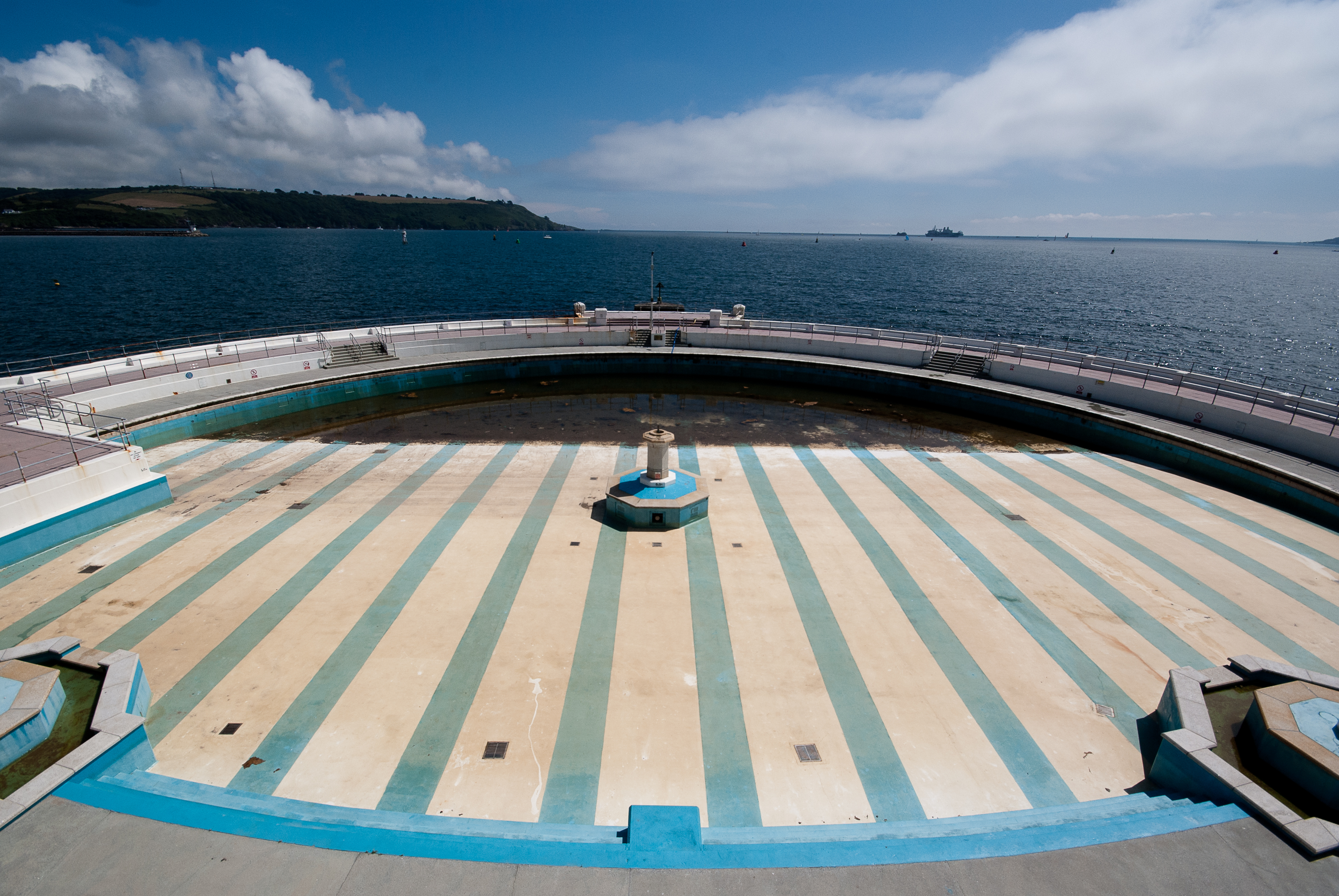
The purpose of this exercise is to research different companies offering inkjet (giclée) and C-type printing. All prices are for A3 prints as this is a size commonly used for portfolio purposes. I have included descriptions of the options as described on the websites because I am not well versed in the differences between the different types.

Company 1: DS Colour Labs

C-Type Prints – described as ‘Silver Halide printing light-sensitive paper and silver based chemistry, a technology which has been constantly refined over time.’

Lustre £1.20

Gloss £1.20

Pearl £7.49

Velvet £7.49

Lustre – ‘a very natural photographic finish reminiscent of traditional photographic printing. Coated with a slightly stippled texture Lustre prints are very resistant to fingerprints, scratches and scuffs and feature a semi-matt finish with minimal glare.’

Gloss – ‘produces higher contrast in your work with a vivid, glossy finish which accentuates the colour to give a punchy, rich feel.’

Pearl – pearl-like crystals give a unique high-gloss effect and add a beautiful iridescent touch to your photos with deep blacks and purer highlights 

Velvet – ‘professional coating with a zero-reflective top layer creates a stunningly soft and deep- matte effect…..enhanced color reproduction, white purity and excellent image stability.’

Giclée Prints – highest quality, archival digital inkjet prints available.

Permajet – £10.99

Hahnemuhle – £11.99

PermaJet – T’he image reproduction will surpass your expectations in all areas providing images that meet the highest standards of Museum quality giclee prints. Photographers and artists will appreciate the natural heavyweight feel and smoothness of the range as well as the subtle, yet varying, base colours which bring your images to life and add a sense of depth and clarity which cannot be reproduced on a normal gloss or satin paper.’

Hahnemuhle Photo Rag – The fine, smooth surface and feel of Photo Rag make this paper very versatile and it is ideal for printing both black and white and colour photographs and art reproductions with impressive pictorial depth.

I note that the offer sample packs to enable comparison of the different papers and this is something I intend to look into further to improve my knowledge of the variances.

Company 2: Loxley Colour

C-Type Prints

Loxley’s offering is very similar to that of DS, apart from the inclusion of Metallic instead of Pearl. Metallic is described as ‘A beautiful shining paper that is perfect for those showstopping images. The Metallic print finish adds a sheen to images with an almost reflective appearance.’

Lustre £4.52

Gloss £4.52

Metallic £6.77

Velvet £6.77

Giclée Prints

Loxley offer a wide range of different papers from Fujifilm, Hahnemuhle and Epsom all priced at £12.99 each.

Company 3: Theprintspace

C-Type Prints

Again, the offering from theprintspace varies slightly from that of the other two, offering matt, gloss, flex (described as ‘super-gloss’) and metallic.

Matt £8.54

Gloss £8.54

Metallic £10.28

Flex £13.36

Giclée Prints

Seven different papers are available, from Canson, Epsom and Hahnemuhle, all priced at £11.23.

The research shows there is a very wide range of different papers and pricing available and photographic printing appears to be something of a minefield to the inexperienced. I have used both DS Colour Labs and Loxley before and the only different I have found was that Loxley seem to offer a more premium service in terms of customer service and packaging but not necessarily in the finished product itself. This is an area I definitely need to improve my knowledge in and I will allocate some expense to trying out the different options later in the year.

Technically, it could be argued that an inkjet print is not a photograph because they are created by laying ink onto a sheet of paper rather than being photography in its purest sense and I am inclined to agree, also the argument is a little pedantic. It is, of course, still a print of a photograph, since the original image has been made with light. In practical terms, however, I would not be put off using or purchasing a print purely because it was an inkjet.

Exercise 5.1: Origins of the White Cube

Thomas McEvilley’s introduction to Brian O’Doherty’s Inside the White Cube: the Ideology of the Gallery Space summarises the book as follows:

Modern art gallery spaces are built to a rigid set of rules; walls are white and there are no windows, thus the art is free to ‘take on its own life.’ The context is similar to that of religious buildings; the artworks appear out of time so take on their own status of appearing in limbo in a ‘chamber of eternal display.’ Egyptian tomb chambers which also built as a removal from the outside world, and from the flow of time, as were Paleolithic cave art chambers, which were deliberately set in areas which were difficult to access. These spaces are ritualistic and attempt to ‘cast an appearance of eternity over the status quo in terms of social values and also, in our modern instance, artistic values.’

O’Doherty states that, on entering the white cube, we give up our humanness – like in a religious building we do not speak, eat, drink, lie down, since or dance. The white cube attempted to bleach out the past and become a transcendental space, but the problem with transcendental principles is that they refer to another world.

Plato theorised that ‘at the beginning was a blank where there appeared inexplicably a spot which stretched into a line, which flowed into a plane, which folded into a solid, which cast a shadow, which is what we see’. The white cube represents the blank which Plato claimed everything evolved from.

It is interesting that the white cube is compared to a religious building as I have certainly felt a reverence when looking at iconic artworks similar to that within a cathedral and agree with the sensation of feeling out of time. However, the modern gallery is also often too overcrowded (pre-COVID) to gain that sense so that actually achieving it is rare. The aim of achieving commercial success by getting as many visitors in as possible does not easily align with the design sensibilities of the white cube and thus the effect is often lost.