Assignment Three Preparation

My working method for assignment three was straightforward compared with the previous two assignments; these are simple observations made on my frequent walks during lockdown. I was acutely aware of the effect walking around an empty city has on the psyche and the number of examples available to record were numerous. The main challenge I found, then, during this assignment was choosing which images to use. I assembled what I thought was the final collection several times and the next day changed my mind. even now in front of me is an image that didn’t make it into the final assignment and I am wondering whether I should have included it. However, a final decision has to be reached and so I am continuing with the most recent selection I made. I am, however, planning on making an alternative version to post on social media. Below are my contact sheets showing all the images that were part of my final decision making process.

Research: Mat Hennek

Mat Hennek is a German photographer who had a successful career in commercial portrait and product photography before moving into the art genre.

His recently released book Silent Cities coincidentally came out during the 2020 Coronavirus pandemic lockdown across Europe but in fact the images were all made over the last seven years during normal human social and economic activity.  Hennek visited several cities worldwide for this series, including Tokyo, Dallas, Shanghai and Paris, making unplanned walks through the cities whilst consciously avoiding the usual tourist areas.

The urban landscapes are almost devoid of people, save for the occasional exception: a lone cyclist; a group of half concealed travellers.  Perspective is most often flattened, frequently cutting out the sky and sometimes the foreground too, creating a barrier to the viewer, preventing them from feeling a part of this landscape.  In some images the pattern of the architecture removes all sense of perspective, leaving the viewer disorientated and confused.

Prior to this series, Hennek produced a series entitled Woodlands, which are images of groups of trees completely filling the frame, silent, almost monochromatic, flattened in perspective.  I think Hennek has approached the urban environment in the same way; his colours are subdued, often feature greenery, and there is a sensitivity to texture and material and their juxtapositions.  Forms in both series are often pared down to simple compositional elements.

The result of Hennek’s approach is the impression that the cities are waiting for people to appear and carry out their usual business, as if they are on hold.  There is a sense of the uncanny, of time having stopped.  The overall sense is of beauty in the simplicity of being able to view these structures unobstructed but also of silence and stillness, like holding one’s breath.

References:

Hennek, M. (2020) Silent Cities. Göttingen: Steidl

mathennek.com/works/silent-cities/ [Accessed 15 August 2020]

Assignment Two: A Journey

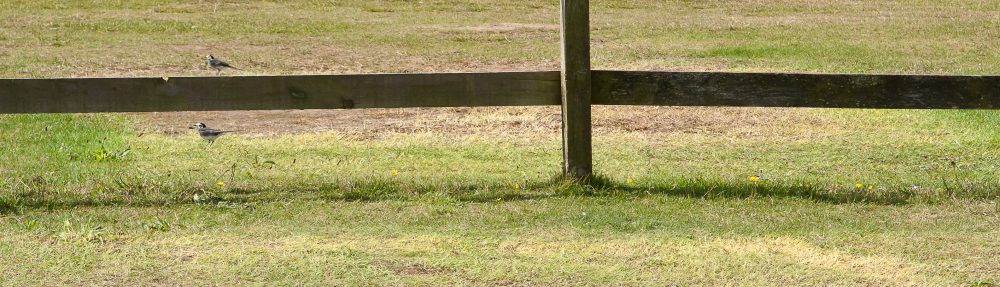
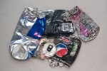
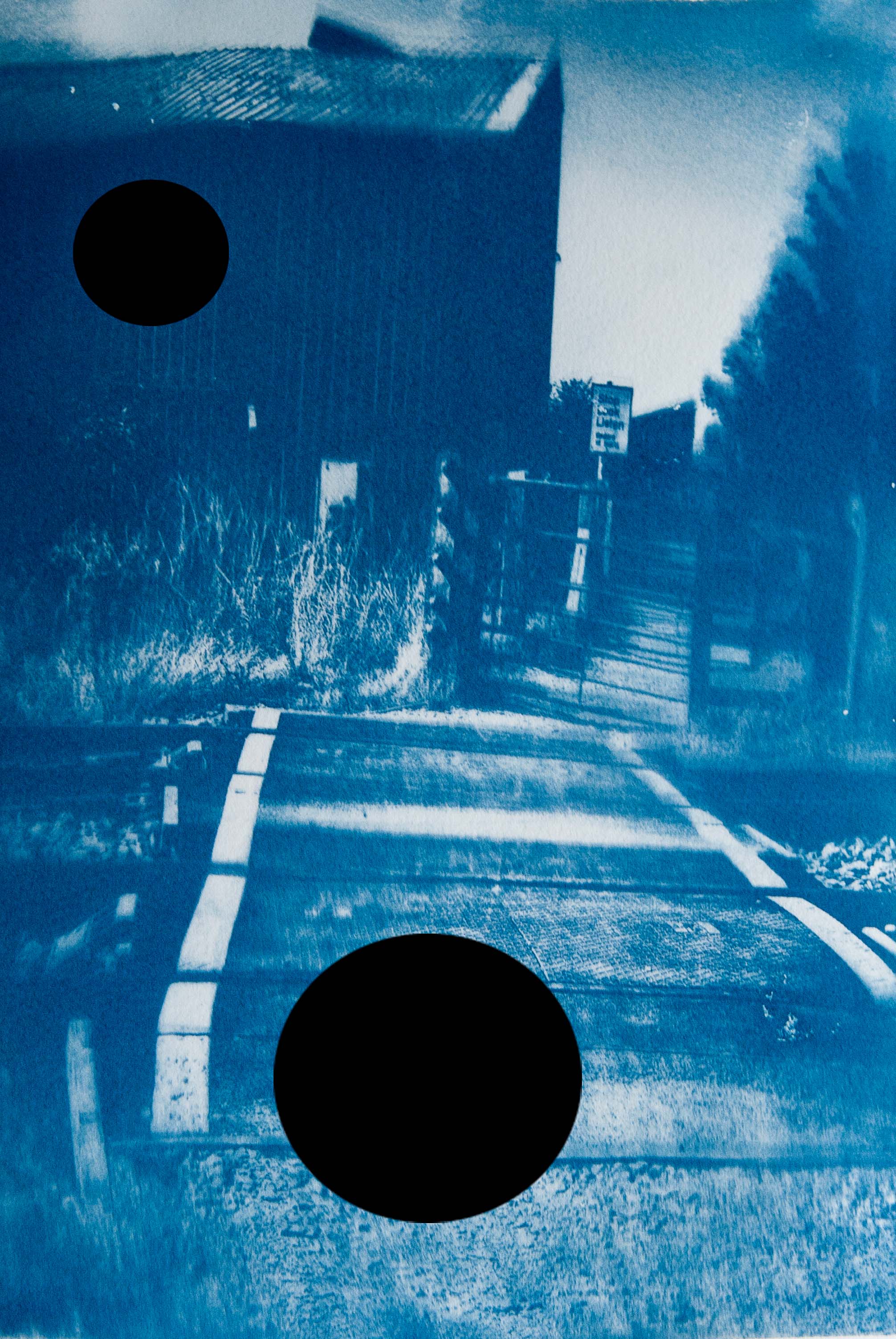
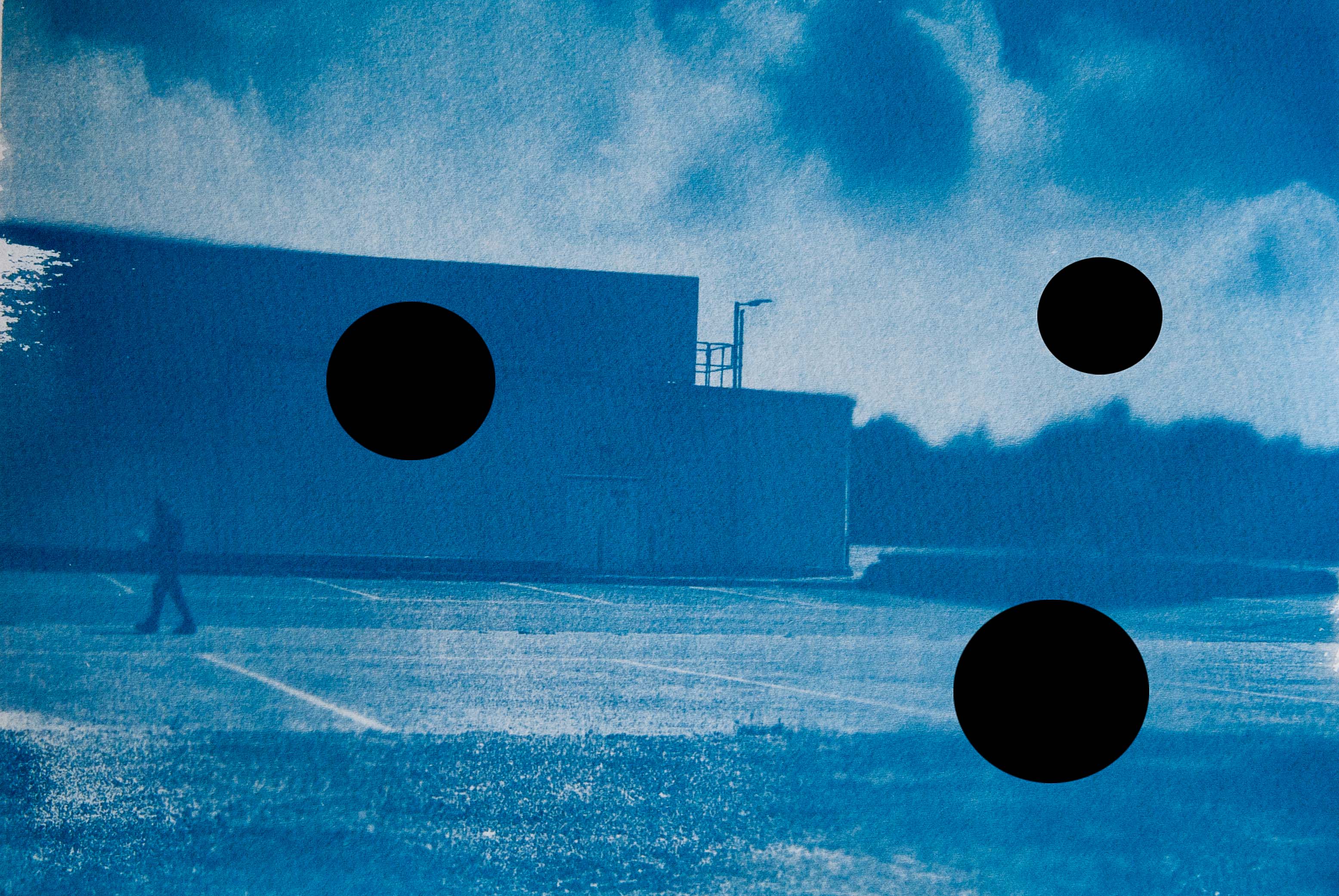
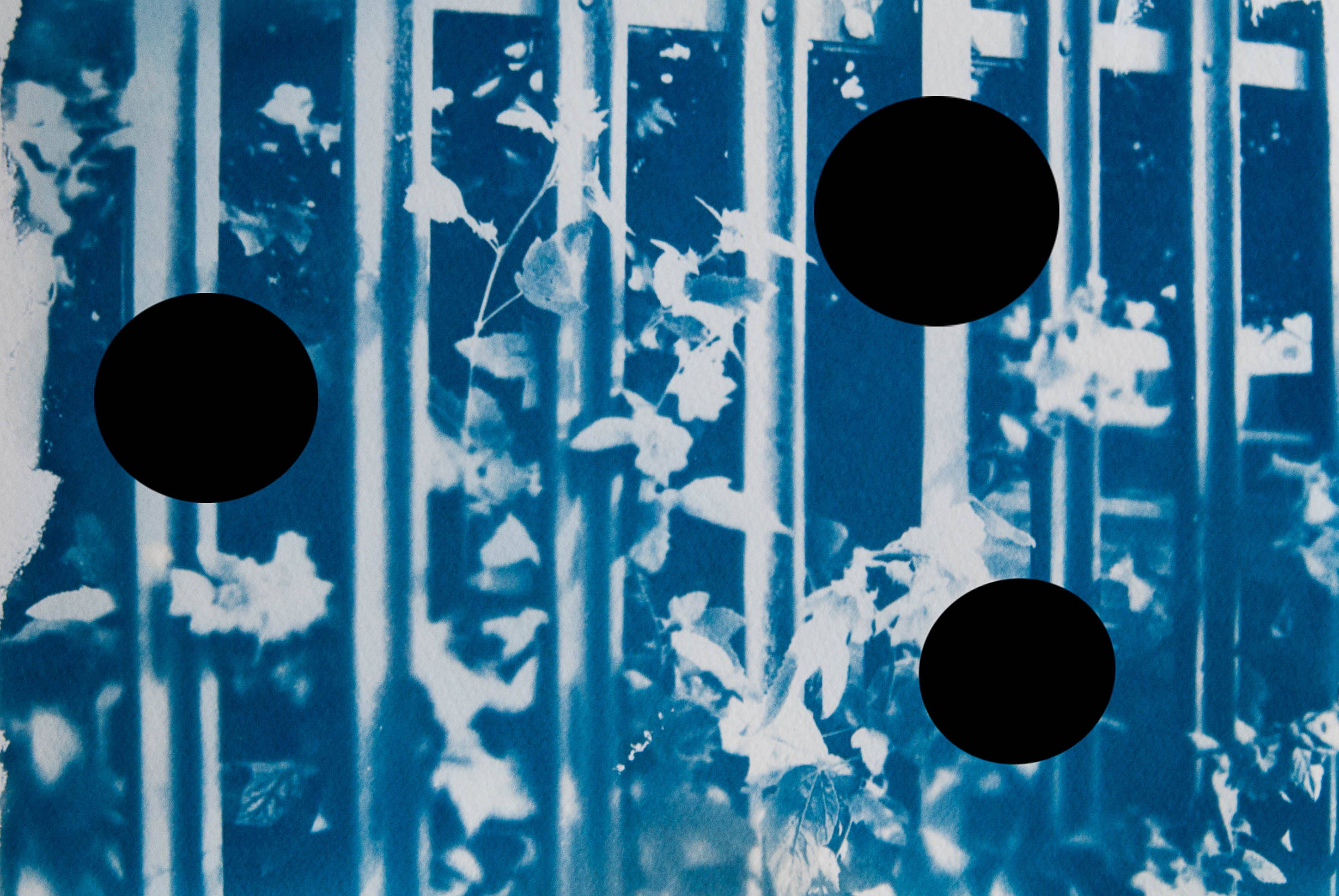
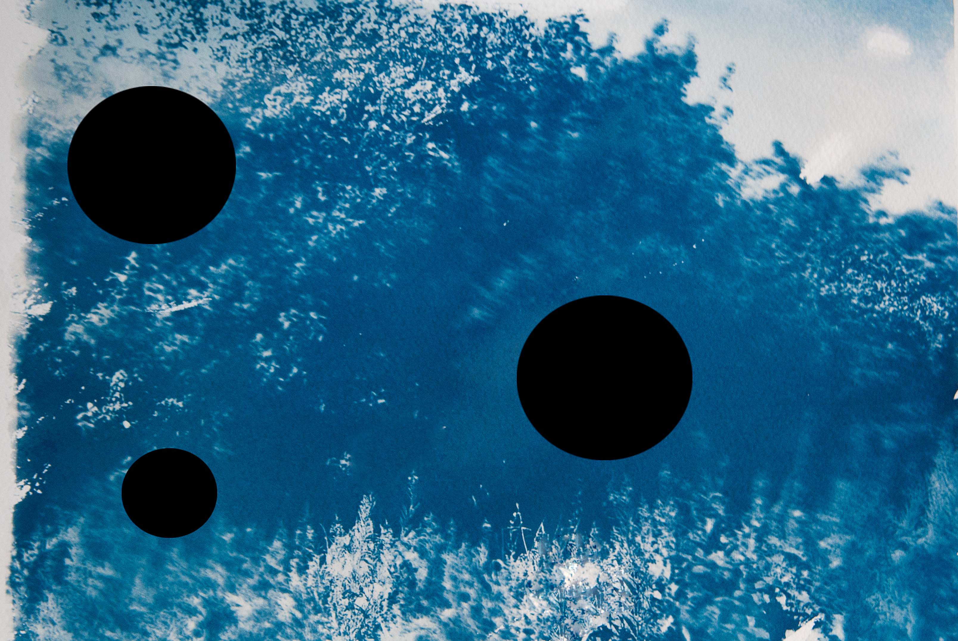
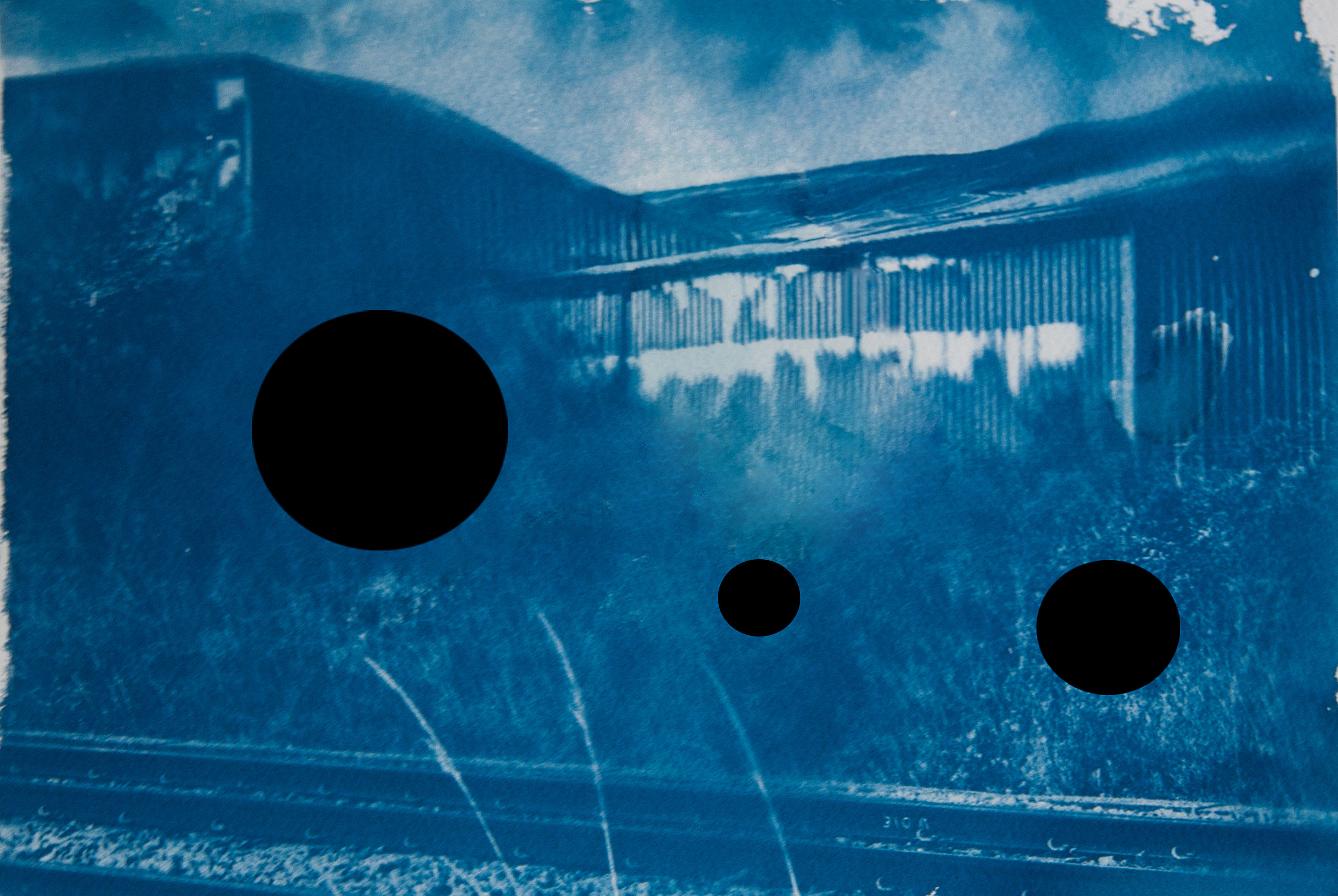
For this assignment I made several walks in the industrial estate around where I work. These are familiar routes for me as I walk for exercise every lunchtime.  The area is a contrast of expensive glass-fronted buildings with armies of gardeners working with military precision and older, shabbier, buildings, ‘bastard children of the tractor shed’ as coined by Farley and Symmons in their book Edgelands.  I usually see the same people on a daily basis; mostly lone men in smart business attire and groups of men in high visibility work jackets, plus the occasional dog walker on an extended trek from the local housing estate.

It was whilst reading Edgelands and carrying out the exercise to explore a road that I started thinking of the typicalities of certain man-made landscapes; I have never visited any of the places in the book but I know what they look like because every town has them.  I started thinking about human behaviour within and effects upon the landscape and as I walked, I considered the litter that seems to be left almost everywhere and began to wonder whether we can tell something about the landscape by the litter we find there.  For example, would objects discarded in the street on an industrial estate be the same as those dropped in a town centre or housing estate?

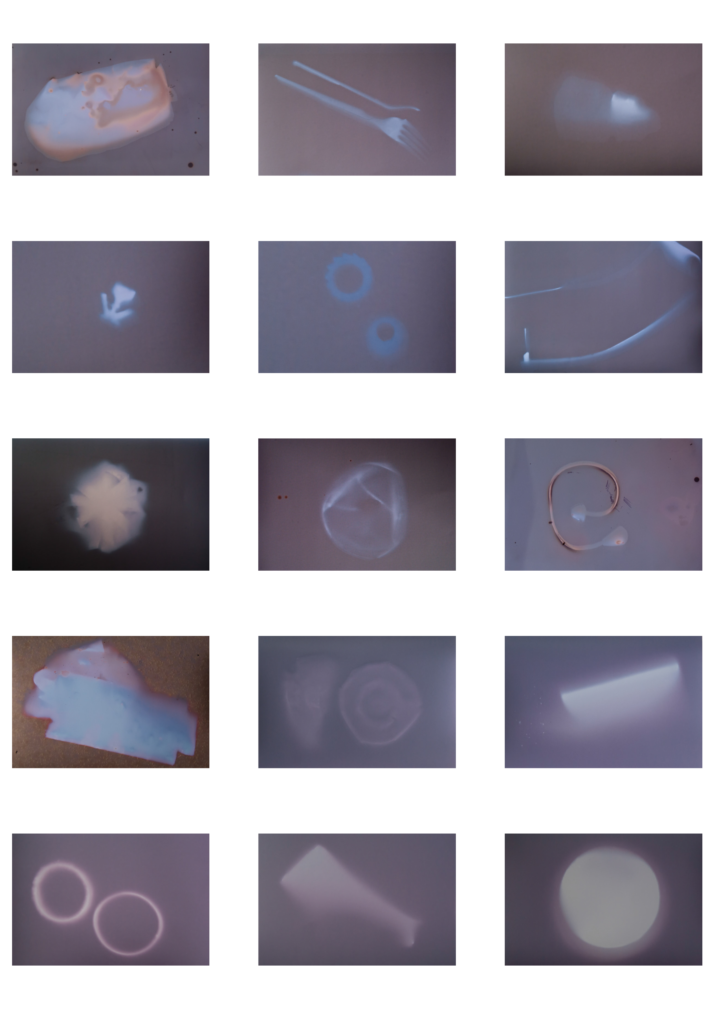
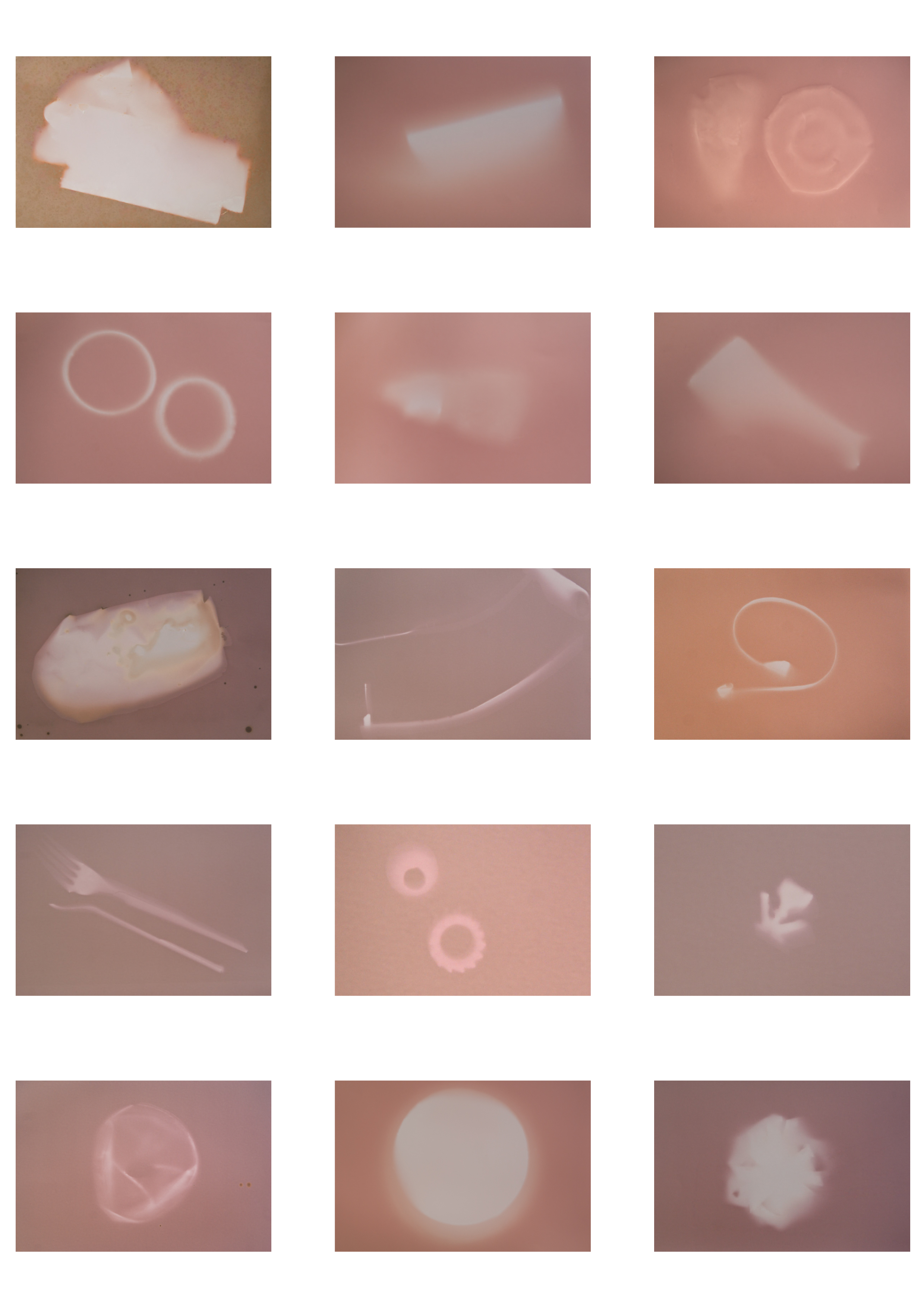
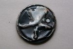
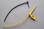
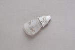
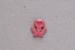
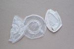
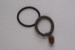
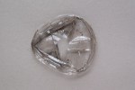
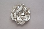
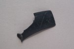
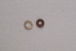
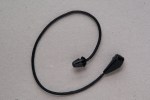
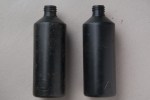
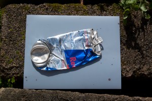
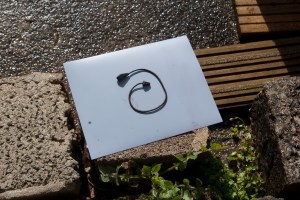
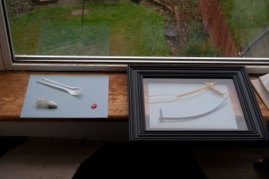
In keeping with my idea of categorising litter by the area where it was collected, as I brought pieces home I photographed them in a catalogue style: all from the same overhead viewpoint; positioned on a plain grey background; and all collated with objects of the same type.  This typological approach was inspired by the 1980 series Water Towers by Bernd and Hilla Becher which was part of the Topographics exhibition.  The resulting images make an interesting set as they are and I considered submitting them in that form but wanted to develop the series further to see where it could progress.

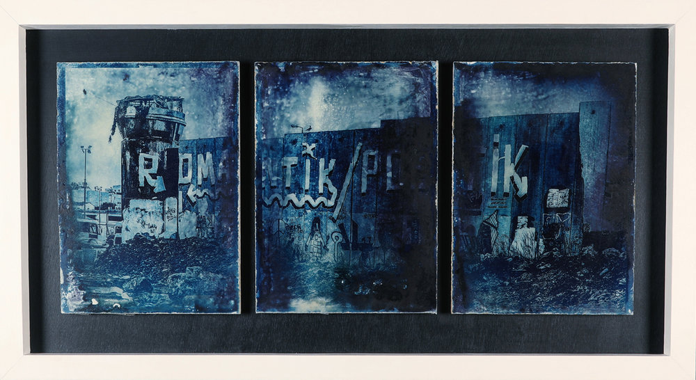
Artists like Naomi White have considered the effects of humans on our environment by making litter into art and her series Time Capsules from the Anthropocene uses discarded plastic objects such as carrier bags to warn of the dangers of of our throwaway lifestyle. I like White’s practice of removing the litter from its resting place and using it as part of an image created in a separate setting.  However, I wanted my litter to tell the story of its landscape much as Richard Wentworth’s discarded and repurposed objects tell a story about  human behaviour.

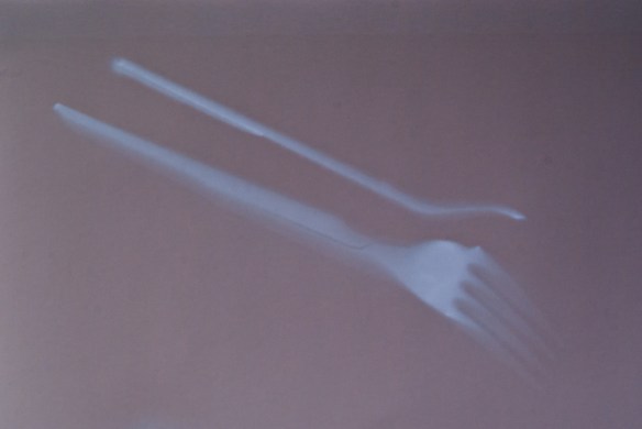
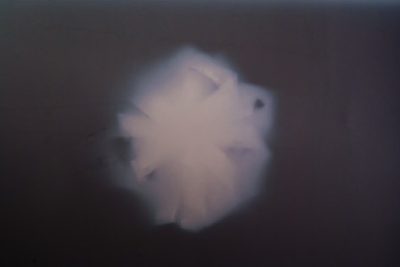
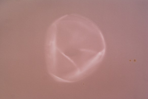
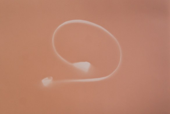
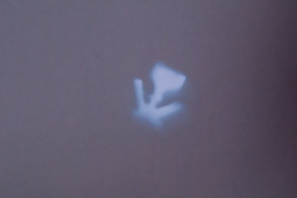
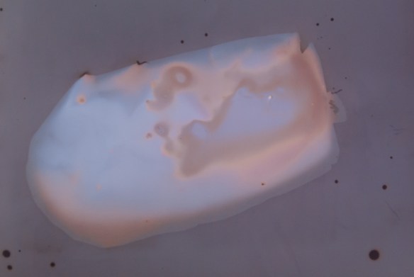
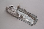
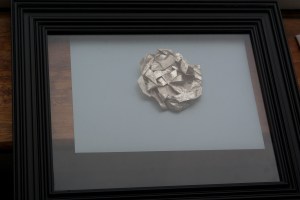
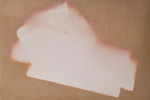
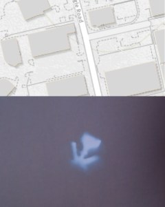
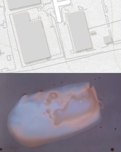
I noticed a marked difference in the physical deterioration of the objects that had clearly been discarded some time ago.  They had been ravaged by the light and weather compared with newer items which looked as though they had been dropped only days or even hours before.  This effect of the outdoor environment on the physical condition of the objects led to my idea of making lumen prints with them.  The act of directly using sunlight to create the images reflects the physical changes manifested on the objects themselves by their exposure to the environment and is also a natural progression on from the cyanotype process I used for Assignment One.

I am pleased with the result of this project as I set out to ask a question about location, that is what the litter found in that location can tell us about the landscape.  The items found were clearly directly related to the industrial estate and displayed on their own create a thread to the landscape that the viewer can follow.  My intention would be for this to be the first part of a series looking at different environments and the different types of discarded objects that can be found there.

References:

Farley, P. and Symmons Roberts, M. (2011) Edgelands Journeys into England’s True Wilderness. Rochester: Vintage Digital

www.tate.org.uk/art/artworks/bernd-becher-and-hilla-becher-water-towers-p81238 [Accessed 20 April 2020]

www.naomiwhite.com [Accessed 23 April 2020]

www.lissongallery.com/artists/richard-wentworth [Accessed 23 April 2020]

Bright, S. (2005) Art Photography Now. London: Thames and Hudson


Assignment One: Tutor Feedback and Response

I am very pleased with the feedback I received from my tutor for Assignment One.  My tutor said I write very well and am able to communicate my ideas, influences and creative ambitions.

The cyanotype colour works well as an emotive aid, evoking a sense of melancholy and turning everyday landscape scenes into something uncertain.  It also adds drama to the optical distortion and diffusion created in the cyanotype process which in turn adds to the sense of the uncanny and uncertainty.   The black graphics disturb the notion of the photograph depicting something that was once in front of the camera as well as offering a psychological gateway.

I am pleased to have achieved a balance between descriptive and analytical writing as feedback from previous modules has indicated that my content is a little light on the analytical aspect and this is something I have been consciously working on in response.

I have a list of follow up actions to work through:

  • Include details of the creative process leading to submitted assignments
  • Develop this assignment further by making physical cuts in the cyanotype prints rather than adding the black shapes digitally (due to time constraints I will carry this out at the end of the module prior to assessment)
  • Investigate Ackroyd and Harvey who developed grass seed that could retain photographic impressions for a long time.  I have heard of this before and I have an idea surrounding grass for a later assignment so this will be useful research
  • Look at Freund’s paper on the uncanny with a view to developing assignment one further
  • Look at John Balldessari’s work using coloured dots
  • Tidy up missing references and spelling in my learning log.  I have started to go through this and it is part of my standard workflow prior to assessment so I will continue to read back through previous submissions and amend as required.

Assignment Two: Preparation and Set Up

For Assignment Two, I have been walking around the industrial estates where I work, collecting items of litter I found.  In response to the exercise on typologies I ordered the items into sub-groups and photographed them on a sheet of plain grey paper, as a way of cataloguing my finds.  I wanted to know if the type of litter found in a certain landscape is reflective of the surrounding human environment.  The project could be presented as it is alongside collections resulting from walks in different areas.


I pursued the idea of sunlight affecting the items by producing lumen prints of the objects positioned in a similar way to the above on sheets of photographic paper and left to develop in the light.  This was the first time I had experimented with the creation of lumen prints.  Where possible, I laid a glass frame on the item to flatten it and create a more defined outline.  The weather was changeable while I was making the prints so some were laid on a windowsill indoors rather than outside.

I found that the images produced outside contained a greater range of colours and rain produced an interesting effect that could be explored further for future projects.

However, the effect was lost somewhat once the images were fixed and the colour balance changed.


Finally, in progression of my original idea of whether different litter is dropped in different landscapes, I experimented with the idea of incorporating maps into the project, an idea I later rejected as I felt the lumen print images were effective on their own.


Assignment One – Beauty and the Sublime

I spent a lot of time thinking about the sublime for this section of the course and what it means to me.  For me it is a sense of longing mixed with trepidation, of desire for something mixed with a sense of uncertainty or danger.  I saw several examples of works that represent the Sublime; a common subject in this area is the sea as I discovered in works by Tacita Dean, Nadav Kander and Dafna Talmor.

Thinking about my own experience, as a parent the greatest day to day fear is of something happening to my children.  My daughters are of the age to be beginning to forge their own independence, with some of my eldest’s friends allowed to ‘hang out’ with others in various public spaces.  Whilst at my aunt’s recently she told me that an unexplored World War Two bomb had been found in the woods where we used to play as children and I distinctly remember as a child seeing a bra hung from a tree and wondering what had happened to its owner.  It is the attractiveness of these places that are so desirous to youngsters with their ability to stir up mixed emotions of being grown up coupled with the possibility of a sense of the unknown, even danger and the parents’ over-imaginative visions of terrible accidents and abduction that I have chosen to explore with this project.

Having seen Mark Preston’s work Zone A – A Palestinian View of Jerusalem I became interested in the cyanotype process and liked the idea of using it on a more industrial subject other than the usual delicate florals with which it is traditionally associated in art.  I also looked at the work of Dafna Talmor and liked the idea of holes in the image seeming to represent the uncomfortable, even dangerous.  Similarly, Aliki Braine uses holes in her work, this time to encourage the viewer to fill in what is missing from their own imaginations.

With the above in mind I have created a series of cyanotypes of the places children and youths like to play and congregate independently, the places where they can be free of parental influence for a short time.  Such locations are beautiful in their own way by being desirable and exciting not only for the escape from adult control but also the very fact that parents often do not really like their children playing there coupled with the sense of unknown danger.  The sign at the railway line wants of the danger of trains, a lone man walks across the deserted car park, a crudely made rope swing resembles a noose, all alluding to the fear of the parents and hint at the possibility of something going wrong.  The black circles resemble holes that allow the viewer to insert their own imaginary fears and thus the work becomes more personal.

I would like to develop this work further and experiment with cutting actual holes of different shapes into the images.  I have not done this at this stage due to the time constraints of making individual cyanotypes and the need to move on in the course.  I would also like to try burning the images and investigating other methods of destruction to find alternative ways of representing the trepidation element of the works.

DSC07548-Edit-Edit-EditDSC07550-Edit-Edit-EditDSC07551-Edit-EditDSC07552-Edit-EditDSC07553-Edit-EditDSC07556-Edit-EditDSC07557-Edit-EditDSC07558-Edit-Edit

DSC07554-Edit-Edit


Mark Pearson

I discovered Mark Pearson’s work at a Plymouth University alumni show.  Pearson is a Scottish photographer specialising in photojournalism, covering conflict and natural disasters.  His work has taken him to places such as Pakistan and Israel and he has covered the after-effects of tsunamis and earthquakes.  He is particularly interested in man-made physical boundaries.

At the exhibition I saw the piece Zone A – A Palestinian View of Jerusalem which is a cyanotype triptych on concrete.  This piece was created in collaboration with concrete sculptor Noel Brennan.  The work depicts the wall separating West Bank Palestine from Israel, an unusually stark subject for a cyanotype, a method traditionally artistically associated with flora and fauna and commercially with the crisp, perfect lines of a blueprint.  In contrast, Pearson’s work enters the war zone, the concrete base a sculptural reference to the wall itself.

Zone A - A Palestinian view of Jerusalem    Cyanotype Triptych on Concrete, 122cm x 65cm    A chemical experiment and collaboration project in photochemistry and concrete. Cyanotype triptych on concrete panels, with a digital image I shot in Palestine that is chemically embedded onto the surface of the concrete, 2018.

The monotone approach works well with the graphic, angular lines of the subject matter.  The textural surface of the concrete adds a hard, grittiness that reflects the harsh nature of the events happening in this environment.

http://www.markpearson.co.uk [Accessed 26 December 2019]