Exercise 2.2: Explore a Road

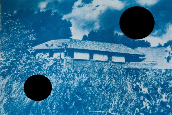
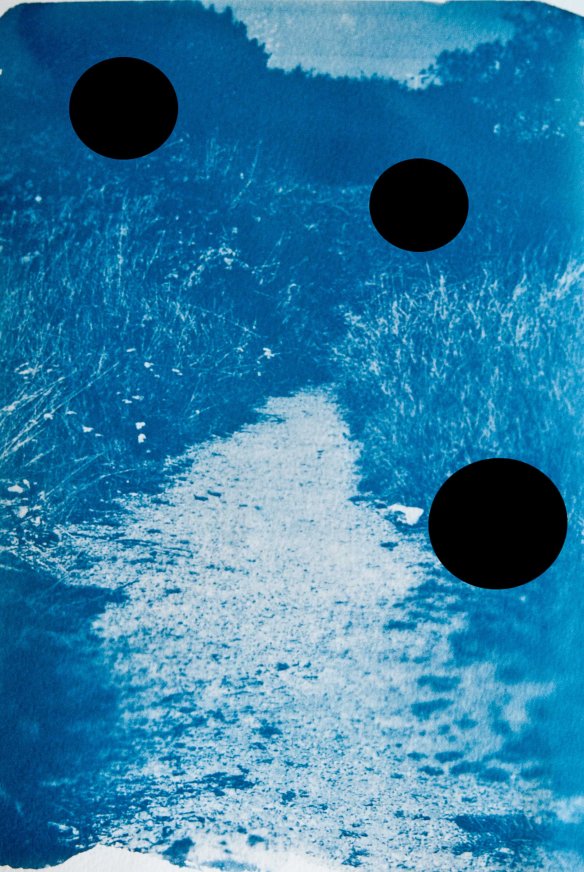
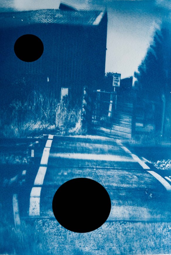
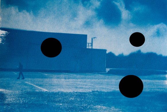
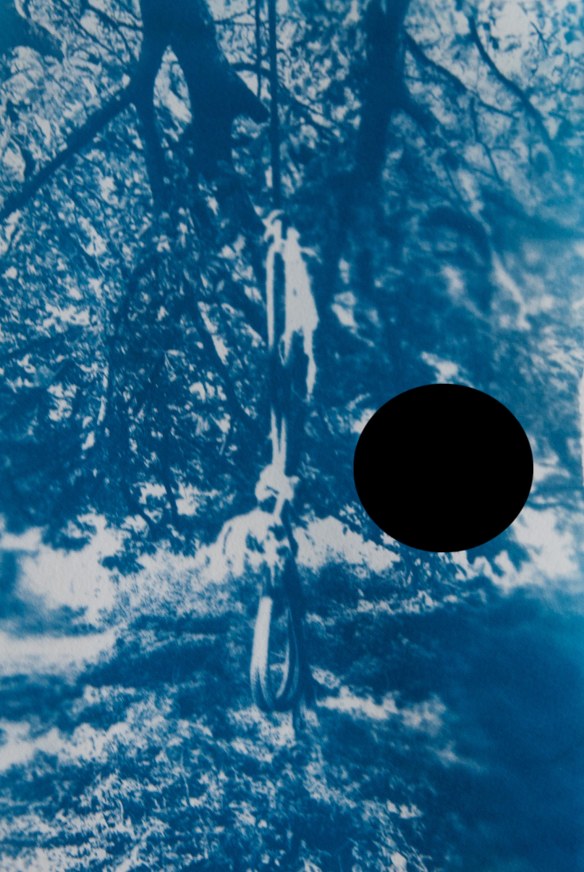
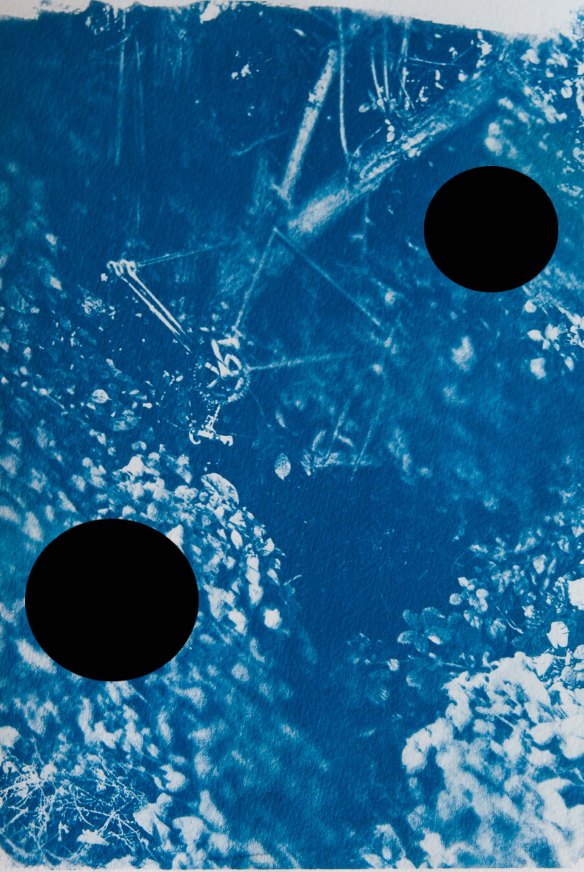
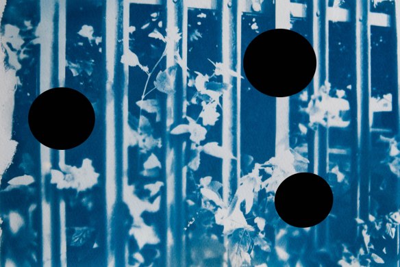
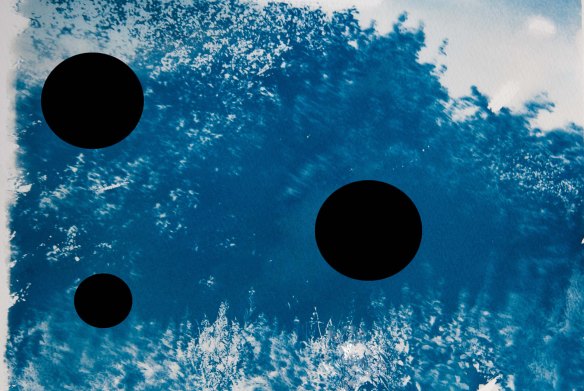
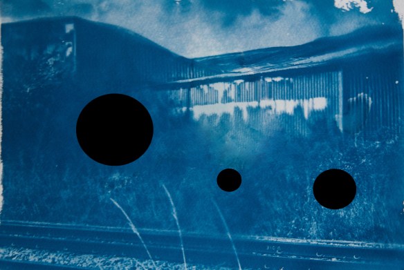
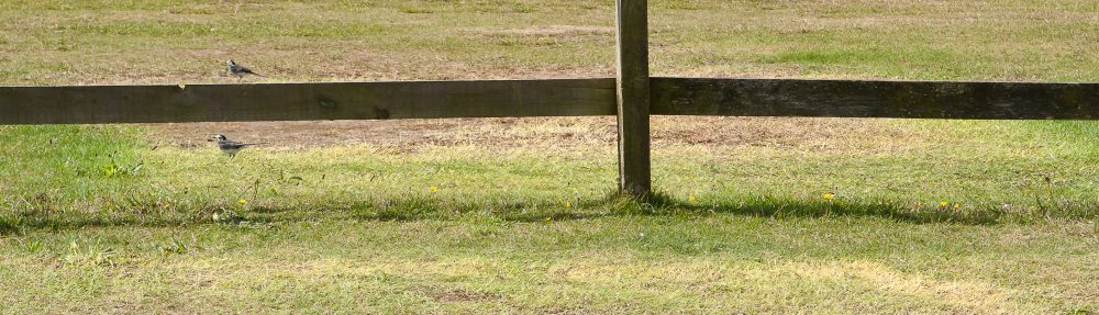
I take a daily walk during my lunch break so for this exercise I decided to record what I notice when taking this familiar path.  The process was not pre-mediated so the photographs are of random objects and scenes that caught my eye.

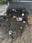
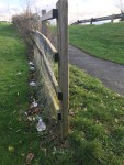
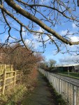
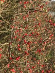
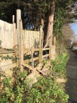
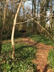
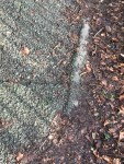
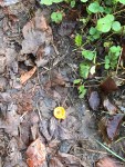
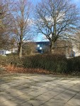
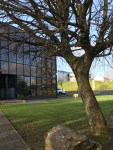
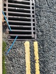
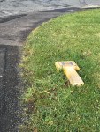
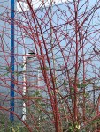
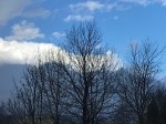
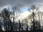
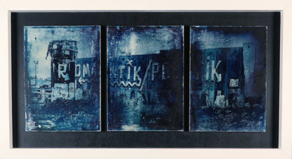
Looking over the result, I think the common themes that thread through these images are humankind’s impact on nature and pattern and colour.

For the second part of this exercise I watched the film Mango Dreams.  The film follows a Hindu doctor, Amit Singh, as he is diagnosed with dementia and takes a road trip with a Muslim rickshaw driver, Salim, to revisit the locations of the major milestones in his life before he forgets the memories forever.

At the beginning of the film we see Dr. Singh as a young child walking down a path in a sepia tinted clip interspersed with a modern day adult Singh running down a path; the path is used as the connection between the two scenes, acting as a metaphor for the passing of time.  Shortly after we see Singh and his friend watching a television history documentary on the partition of India; scenes of thousands of refugees walking and travelling uses the road to signify mass migration and displacement.

After his dementia diagnosis, Dr. Sing’s son arrives from America, wanting to move him into a nursing home until he can be moved to America.  The two men fight and Dr. Singh walks out.  We see him walking down dusty streets; the road has now come to signify his escape and freedom.

Dr. Singh meets rickshaw driver Salim who reveals the doctor saved his son’s life some years ago and would not accept any payment and offers to take him anywhere he wants to go.  Dr. Sing answers ‘home’; he wants to return to his childhood home.

The two embark on their journey, and the road becomes a metaphor for the development of their relationship.  There are many arguments between the two and we learn that Salim hates Hindus because his wife had been raped and burned to death by Hindu rioters in Gujarat.  Dr. Singh talks of his family who were murdered by Muslims, and of the personal responsibility he feels for the death of his brother.  We see the road develop from dusty track to tarmac roads to multi-lane highway as the pair visit sites such as Dr. Singh’s college where he studied to become a doctor and the orphanage where he met his future wife.  The locations are in reverse chronological order in Dr. Singh’s lifetime; the road follows a timeline backwards through his life.

Eventually, Dr. Singh’s son catches up with him and after some discussion and argument, the two embark on the final leg of the journey on foot, with Salim in his rickshaw following behind.  The road has become a simple dirt track again as the trio journey to Dr. Singh’s birthplace and the location of his family’s murders.

The road performs several aids to the storyline in this film; as well as the literal interpretation of the journey, we see it as a link to time.  At the same time as Dr. Singh is moving forward on his journey, he is moving backwards to relive his past.  We also see scenes of mass displacement via the images of refugees travelling along roads and this links to Dr. Singh’s physical and mental displacement from his childhood and his quest to reconnect with his memories.  The road also follows the thread of the relationship between Dr. Singh and Salim as they slowly cast aside their preconceptions of different religions and become close friends over the course of the long journey.

Exercise 2.1: Territorial Photography

In Joel Snyder’s essay Territorial Photography he discusses The developments in American landscape photography practices from the 1850s to the 1870s.  He begins by explaining how early photographers were from privileged backgrounds and were familiar with tropes of landscape depiction learned from paintings;  the picturesque and the naturalistic.

However, by the mid-1950s photographers were increasingly from less educated backgrounds and this led to a turn to a more factual, realistic and ‘mechanical’ approach to landscape photography.

By the 1860s the value of photography for documentary use was becoming more recognised and thus more practised.  Photography leaned further toward ‘articulation, high finish and precise rendering of detail’.  One photographer to embrace this new direction was Carleton Watkins.  A champion of progress, he was devoted to the idea of developing the land with new railroads and other industrial innovations but did not seem to have considered the impact on the local inhabitants.  Snyder discusses how Watkins’ images show of locations including Utah, Nevada and Yosemite Park show man made infrastructure and the natural landscape coexisting in picturesque harmony alongside each other.

In contrast, Snyder examines the work of Timothy O’Sullivan, who participated in two geological surveys across Nevada, Utah and New Mexico, and whose work depicts the land as bleak and inhospitable.  O’Sullivan was not given any specific instructions or brief but was merely told to ‘give the sense of the place’.

The difference in approach by Watkins and O’Sullivan can clearly be seen in the images below.

Watkins’ image is idyllic and picturesque and follows the traditional landscape composition; even today it could be produced as a picture postcard.

Carleton Watkins

Cathedral Rocks, 2,600ft, Yosemite


In contrast, O’Sullivan’s image defies landscape tradition in using a portrait format and the composition is arranged so that the rock completely blocks the sky.  Unlike Watkins’ image, the landscape looms forebodingly and even the evidence of human  habitation in the form of the Anasazi Indian pueblo does little to convince the viewer that the land is hospitable, not least because of its location at the mouth of the vast cave entrance which diminishes it into insignificance.

Canyon de Chelly, Arizona; photograph by Timothy O'Sullivan, 1873.

Canyon de Chelly, Arizona (1873)


References:

www.britannica.com/biography/Timothy-OSullivan [accessed 18 January 2020]

https://www.theguardian.com/artanddesign/photography-blog/2014/nov/04/carleton-watkins-yosemite-photography-america [accessed 19 January 2020]

Assignment One – Beauty and the Sublime

I spent a lot of time thinking about the sublime for this section of the course and what it means to me.  For me it is a sense of longing mixed with trepidation, of desire for something mixed with a sense of uncertainty or danger.  I saw several examples of works that represent the Sublime; a common subject in this area is the sea as I discovered in works by Tacita Dean, Nadav Kander and Dafna Talmor.

Thinking about my own experience, as a parent the greatest day to day fear is of something happening to my children.  My daughters are of the age to be beginning to forge their own independence, with some of my eldest’s friends allowed to ‘hang out’ with others in various public spaces.  Whilst at my aunt’s recently she told me that an unexplored World War Two bomb had been found in the woods where we used to play as children and I distinctly remember as a child seeing a bra hung from a tree and wondering what had happened to its owner.  It is the attractiveness of these places that are so desirous to youngsters with their ability to stir up mixed emotions of being grown up coupled with the possibility of a sense of the unknown, even danger and the parents’ over-imaginative visions of terrible accidents and abduction that I have chosen to explore with this project.

Having seen Mark Preston’s work Zone A – A Palestinian View of Jerusalem I became interested in the cyanotype process and liked the idea of using it on a more industrial subject other than the usual delicate florals with which it is traditionally associated in art.  I also looked at the work of Dafna Talmor and liked the idea of holes in the image seeming to represent the uncomfortable, even dangerous.  Similarly, Aliki Braine uses holes in her work, this time to encourage the viewer to fill in what is missing from their own imaginations.

With the above in mind I have created a series of cyanotypes of the places children and youths like to play and congregate independently, the places where they can be free of parental influence for a short time.  Such locations are beautiful in their own way by being desirable and exciting not only for the escape from adult control but also the very fact that parents often do not really like their children playing there coupled with the sense of unknown danger.  The sign at the railway line wants of the danger of trains, a lone man walks across the deserted car park, a crudely made rope swing resembles a noose, all alluding to the fear of the parents and hint at the possibility of something going wrong.  The black circles resemble holes that allow the viewer to insert their own imaginary fears and thus the work becomes more personal.

I would like to develop this work further and experiment with cutting actual holes of different shapes into the images.  I have not done this at this stage due to the time constraints of making individual cyanotypes and the need to move on in the course.  I would also like to try burning the images and investigating other methods of destruction to find alternative ways of representing the trepidation element of the works.

DSC07548-Edit-Edit-EditDSC07550-Edit-Edit-EditDSC07551-Edit-EditDSC07552-Edit-EditDSC07553-Edit-EditDSC07556-Edit-EditDSC07557-Edit-EditDSC07558-Edit-Edit

DSC07554-Edit-Edit


Research – Aliki Braine

Aliki Braine is a Paris-born artist currently working in London.  Her work investigates the photograph as material object – a theme I became interested in during the Digital Image and Culture module.  She sees various methods to achieve this, including punching holes, applying stickers and drawing with ink directly onto negatives.

Many of her works study Old Mater paintings.  For example, her work The Hunt is based on Paolo Ucello’s The Hunt In The Forest.  Ucello’s huntsmen and animals in their bright colours are replaced in Braine’s work by a series of black, punched holes of varying sizes.  The viewer is left feeling uncertain as to what should be where the holes are, and to fill in the blank spaces from their imagination.

Image result for aliki braine the hunt"

The Hunt (2006)

In other works, the main subject is obliterated almost completely, leaving the viewer to complete the recognisable symbol in their own imagination.  By obscuring familiarities in this way, Braine raises questions about the viewer’s assumptions and whether a visible trunk and black shape in a field can be experienced and interpreted in different ways.

Image result for aliki braine"

Draw Me a Tree… (Black Out) (2006)


References:

http://www.alikibraine.com [Accessed 5 January 2020]

Shore, R. (2014) Post-Pohotography The Artist with a Camera. London: Laurence King Publishing Ltd

Exercise 1.9: Visual Research and Analysis – Social Contrasts

his exercise asks us to find different social perspectives of the same place.

Dougie Wallace is a British street photographer who has lived in Blackpool and Shoreditch.  His images of London show contrasting sections of society.  His images are brash and bold; his subjects grotesque and larger than life.  His project Harrodsburg focuses on the mega-rich of Kensington, a freak-show of bad facelifts and lurid sartorial tastes.  His objective is to focus on ‘the one per cent’ in an effort to highlight the disparity in society.  It is not a sympathetic portrait of the wealthy elite but personification of the monstrousness of the vast wealth of some in modern society while others are living in abject poverty.

        made in chelsea- gauguin.jpg           made in chelsea-versace twins.jpg

        made in chelsea-Messerschmitt.jpg          made in chelsea-2784.jpg

In contrast the subjects of Wallace’s Shoreditch Wild Life seem less glossy, less shiny, even if they can be just as gaudy.  Any softness in their faces is the result of a life well-lived rather than of artificial fillers and they seem somehow more authentically  human.  This is not a contrast of rich versus poor although wealth or lack of is an obvious factor, but more a contrast of class.

shoreditch exhibition-the royal oak.jpg        shoreditch_new_2012-cabby hot salt beef.jpg

shoreditch brick lane-greedy toy granny.jpg        sleep shoreditch exhibition.jpg


Johnny Miller is a documentary photographer based in South Africa.  His work addresses issues of human inequality including social and cultural perspectives.  His drone-photographed project Unequal Scenes depicts urban scenes from above, highlighting the stark contrast in living conditions for the rich and poor in countries such as Mexico, South Africa and the United States. Using a single image to depict the close proximity in which extreme poverty is placed to the privileged few is a shocking reminder of the unequal distribution of wealth in global society.


Mexico City                                                   Vukuzenzele


Johnny Miller 'Unequal Scenes' Drone Photography   Johnny Miller 'Unequal Scenes' Drone Photography

Nairobi                                                           Tanzania


References:

http://www.dougiewallace.com [Accessed 4 January 2020]

unequalscenes.com [Accessed 4 January 2020]

http://www.millefoto.com [Accessed 4 January 2020]

http://www.lensculture.com/millejoh [Accessed 4 January 2020]


Exercise 1.8: Zone System in Practice

The Zone system was formulated by Ansel Adams and Fred Archer as a way of determining exposure.  The tonal scale is divided into eleven segments as shown below.  given that in photography we do not want pure black or pure white (under- and over-exposure), for practical purposes there are nine zones.

The zone system as invented by Ansel Adams. A helpful way of reading the contrast in a black and white photo. But is it still usable in the digital world. I think it does, with a little tweaking. But you have to change the base rule of Adams concerning ex

Whilst I don’t specifically follow the Zone System, I do follow its principles instinctively, viewing a scene and adjusting exposure in camera depending on the overall tone.

In the image below I was conscious of maintaining exposure in both the rocks and sky.  To maintain a dynamic range within my camera’s capabilities I used the rock to shield the sun and kept the exposure as dark as I could without underexposing the rock.

DSC07495

In the below image of a beach on a sunny day I had to prevent the people from becoming silhouettes whilst being careful not to overexpose the sky.

DSC07127-2

In the portrait image below I kept some definition in the shadows whilst ensuring the girl’s white top did not overexpose.  On the high resolution version of this image, enough detail is kept in the shadows to see a cobweb in the window.

DSC07284


fstoppers.com/education/how-use-ansel-adams-zone-system-digital-world-417047

Exhibition: Mariner

I recently visited the exhibition Mariner a painted ship upon a painted ocean at Plymouth’s Lewinsky Gallery.  Timed to coincide with the 400th anniversary of the Mayflower’s launch for the United States, the exhibition takes as its starting point the Samuel Taylor Coleridge poem The Rime of the Ancient Mariner and interprets it for modern times.  In this context, the exhibition covers such themes as marine pollution, climate change, overseas human migration and human vulnerability.

The work of two artists seemed to be particularly relevant to this point in my studies.  Nadav Kander is a British photographer born in Israel who won the Prix Pictet award in 2009 for his work Yangtze – The Long River.  The two works on display, Water II and Water XVIII are both taken from Shoeburyness as part of his studies of the Thames Estuary, studying the transition between river and sea.  The result are atmospheric black and white works of the churning waters and distant horizons.

Kander’s works are long and tall, positioned very low on the gallery wall, giving the viewer the sense that they can step into the image, as I have previously observed in Mark Rothko’s work.  The large scale swirling water appears sculptural, almost solid as if it were made of plaster, giving a sense of three dimensionality and uncertainty which, along with the minimal composition and distant horizon creates the feeling of the sublime.


Tacita Dean is a British artist working mainly in the medium of film.  Her work Disappearance at Sea was based on the story of British businessman and amateur sailor David Crowhurst (1932-1969) who died at sea attempting a single handed, around the world yacht race after falsifying records of his whereabouts in an attempt to appear as though he had completed circumnavigation.

The work is an excellent example of modern interpretation of the sublime, with the viewer initially walking into a black room, so dark as to be disorientating.  Although the screen is running the film, the room is still so dark that the eyes never adjust fully.  In the meantime,  the screen alternates between following a lighthouse bulb on its rotation and looking out to sea.  As the lighthouse bulb rotates the viewer becomes more disorientated until the view shifts to the sea, where the light from the bulb can be seen crossing the landscape as though searching for the missing yachtsman as dusk descends into night.

References:

www.nadavkander.com [Accessed 27 December 2019]

www.tate.org.uk/art/artworks/dean-disappearance-at-sea-t0745 [Accessed 28 December 2019}


Mark Pearson

I discovered Mark Pearson’s work at a Plymouth University alumni show.  Pearson is a Scottish photographer specialising in photojournalism, covering conflict and natural disasters.  His work has taken him to places such as Pakistan and Israel and he has covered the after-effects of tsunamis and earthquakes.  He is particularly interested in man-made physical boundaries.

At the exhibition I saw the piece Zone A – A Palestinian View of Jerusalem which is a cyanotype triptych on concrete.  This piece was created in collaboration with concrete sculptor Noel Brennan.  The work depicts the wall separating West Bank Palestine from Israel, an unusually stark subject for a cyanotype, a method traditionally artistically associated with flora and fauna and commercially with the crisp, perfect lines of a blueprint.  In contrast, Pearson’s work enters the war zone, the concrete base a sculptural reference to the wall itself.

Zone A - A Palestinian view of Jerusalem    Cyanotype Triptych on Concrete, 122cm x 65cm    A chemical experiment and collaboration project in photochemistry and concrete. Cyanotype triptych on concrete panels, with a digital image I shot in Palestine that is chemically embedded onto the surface of the concrete, 2018.

The monotone approach works well with the graphic, angular lines of the subject matter.  The textural surface of the concrete adds a hard, grittiness that reflects the harsh nature of the events happening in this environment.

http://www.markpearson.co.uk [Accessed 26 December 2019]


Exercise 1.6 – The Contemporary Abyss

In Simon Morley’s essay Staring into the Contemporary Abyss he discusses how contemporary artists have approached the the sublime.

He explains that the eighteenth century Romantic painters sought to depict ‘extreme aspects of nature – mountains, oceans, deserts’ whereas the Abstract Espressionists looked to create art that possessed a ‘depth and profundity European art failed to provide’.  It was not until the 1970s that the concept of the Sublime was reestablished.

The ‘staged landscapes’ of Dafna Talmor consist of cut and montaged strips of negatives featuring landscape scenes.  In particular, her series Constructed Landscapes II feature shifting perspectives that serve to disorientate the viewer; the ground appearing to slide back and forth and slope first one way then another.  To use Morley’s terms, there is no ‘comforting sense of place’ for the viewer in this destabilising landscape.

Talmor’s work often features visible negative space, gaps of white and strips of black like rents in the landscape providing glimpses into a void beyond.  Morley talks of ‘a sense of void – of being on a borderline or edge where we can no longer codify experience …… serving to mediate between being and nothingness’.  In Talmor’s images the viewer is still in the zone of being but is threatened by the nothingness beyond.

The tears remind me of the crack in space and time in the TV show Doctor Who that wipes out events and leaks time energy that can eradicate people’s very existence.

Image result for crack in time dr who"

This window to the beyond, which could be non-existence, something transcendental or something otherworldly, this non-space gives the sense of danger that Morley refers to: quoting Edmund Burke he talks of the ‘heightened and perversely exalted feeling we often get from being threatened by something beyond our control or understanding’; and also Joseph Addison’s description of the sublime as something that ‘fills the mind with and agreeable kind of horror.’


http://www.dafnatalmor.co.uk/constructed-landscapes-ii.html


Contemplating the Sublime

In the glossary of Liz Wells’ book Photography a Critical Introduction the sublime is defined as “That which is grand, noble or outstanding.  In art the Sublime is associated with awe, deep emotional response, and even pain.”

When considering the Sublime in general I think of the ocean: inviting on a calm day; a place of great wonder and beauty; but simultaneously vast and dangerous.  Similarly, as a child I was constantly to be found sitting by the open fire, enthralled by the glorious glow of the captivating flames yet also in awe of its capacity to cause great devastation.

I often think of colour when I think of the Sublime; colour often evokes emotion for me and sometimes I can taste it too.  It is this emotional connection that makes me think of the Sublime when I see poppies: that intense red stirs a sense of pain in me that such a colour is impossible to capture, either by artificial recreation which never seems to be a true likeness, or in cutting the flower itself for viewing indoors; the delicate petals being so fragile that they barely survive the trip to the vase.  The association with loss of life in battle only intensifies what is already there.

Returning to art, I feel the same emotional connection to colour when viewing a Mark Rothko painting.  In the Tate series The Art of the Sublime, Philip Shaw describes how visitors to the 2009 Rothko exhibition at Tate Liverpool ‘observed the paintings with rapt attention’ and how they ‘may have been praying.’  He may well have seen me there, standing close to one of the paintings, its huge scale extending almost to the floor, inviting me to step into its swirling depths like a lake made purely of colour.  It is no surprise to me that there exists a chapel of Rothko paintings.  There is a simultaneously a sense of the sinister in the sombre reds, maroons and blacks alongside the feeling that despite the danger one could be numbly lured in by the intense beauty to calmly float away and be taken from the trials of modern life.

Light Red Over Black', Mark Rothko, 1957 | Tate

Light Red Over Black (1957)

References

http://www.tate.org.uk/art/research-publications/the-sublime [accessed 26 December 2019]

http://www.tate.org.uk/art/research-publications/the-sublime/philip-shaw-modernism-and-the-sublime-r1109219 [accessed 26 December 2019]